Baltimore Branding Project
A fictional city-wide campaign proposal to engage residents and encourage community.
![]()
![]()
![]()
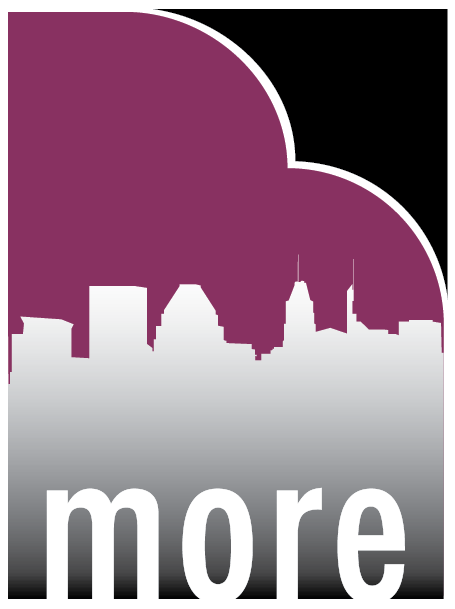
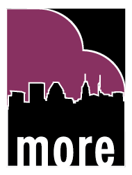
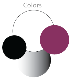
![]() The redesigned logos & colors.
The redesigned logos & colors.
![]()
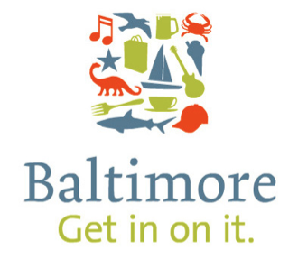
![]() Baltimore’s current logos.
Baltimore’s current logos.
![]()
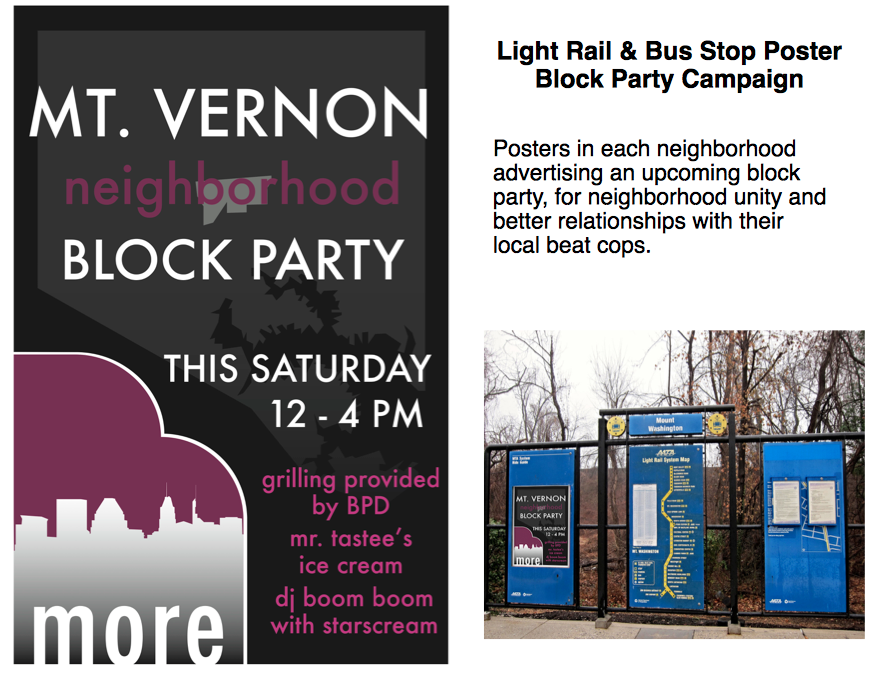
The Campaign: A series of block parties for various neighborhoods, using local businesses as vendors and local talent for entertainment. The Baltimore Police Department’s beat cops for those neighborhoods will provide a cook out for the neighborhood so police and residents can get to know each other in a positive environment. Tents for health services available on site.
![]()

The Client: City of Baltimore, MD
The Task: Redesign their logo and social impact.
The current Baltimore logos are focused too much on the Inner Harbor and tourism, while also managing to be too general. I wanted to bring the focus back to the community and on Baltimore’s character.
The Task: Redesign their logo and social impact.
The current Baltimore logos are focused too much on the Inner Harbor and tourism, while also managing to be too general. I wanted to bring the focus back to the community and on Baltimore’s character.

Context: I was born and raised in Baltimore, but moved away during college in the late 2000s. In 2015, I felt helpless and sick over the death of Freddie Gray at the hands of Baltimore Police, and had to continually defend my hometown to critics. I wanted people to see Baltimore the way I did, and send a message to the people of the city.
Martin O’Malley’s “Believe” campaign in the early 2000s attempted to have citizens care more about their community in a time when Baltimore’s population was decreasing and drug use and crime was at a high. Though his intentions were good, his campaign had mixed results.
Baltimore has continued to have many socio-economic problems, and has by-and-large been criticized for ignoring them in favor of developing the Inner Harbor as a tourist attraction.
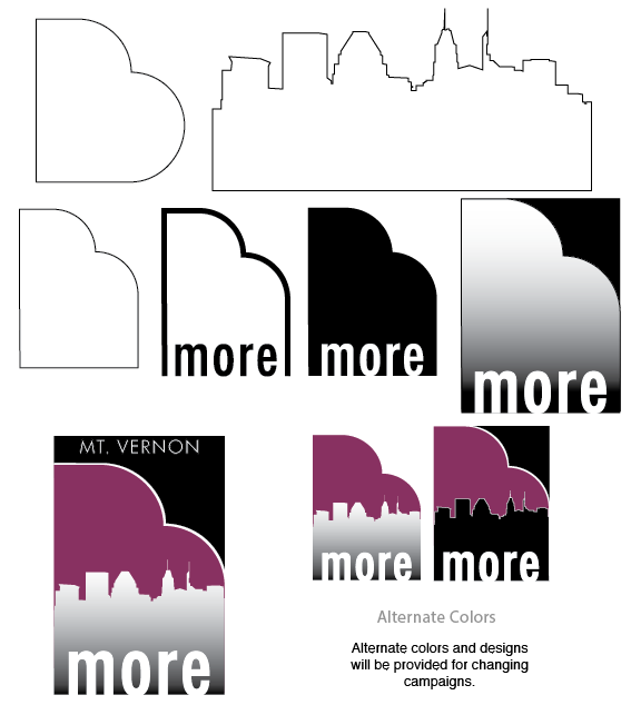
Goals of the redesign:
![]()
![]()
Inspiration & Process:
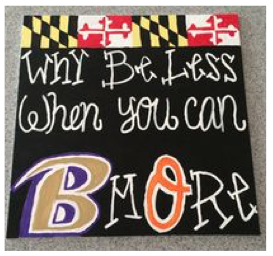
Baltimore is often lovingly shortened to “B-more” by its residents. This easily translates to “Be more,” which is a call to action in this campaign.
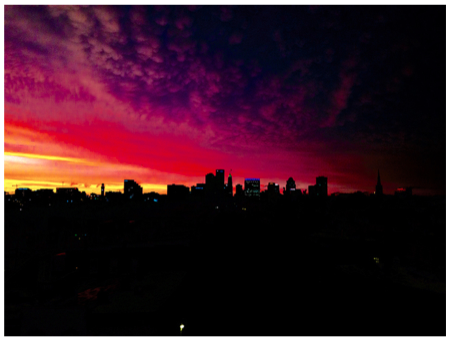
When thinking about the joys of the city as a child, I remembered seeing the skyline at night, and the eerily beautiful colors the clouds and the sky would take on just after sunset. I’ve never seen that unique pinkish-purple anywhere else, and I wanted to incorporate that into my design.
Martin O’Malley’s “Believe” campaign in the early 2000s attempted to have citizens care more about their community in a time when Baltimore’s population was decreasing and drug use and crime was at a high. Though his intentions were good, his campaign had mixed results.
Baltimore has continued to have many socio-economic problems, and has by-and-large been criticized for ignoring them in favor of developing the Inner Harbor as a tourist attraction.
Goals of the redesign:
- Turn attention back to the people of Baltimore.
- Encourage the growth of community, both from residents and city workers.
- Be specific to Baltimore.
- Step away from tourism and sports.
- Good design.
- Incorporate local tradition.
Inspiration & Process:
Baltimore is often lovingly shortened to “B-more” by its residents. This easily translates to “Be more,” which is a call to action in this campaign.
When thinking about the joys of the city as a child, I remembered seeing the skyline at night, and the eerily beautiful colors the clouds and the sky would take on just after sunset. I’ve never seen that unique pinkish-purple anywhere else, and I wanted to incorporate that into my design.
The Campaign: A series of block parties for various neighborhoods, using local businesses as vendors and local talent for entertainment. The Baltimore Police Department’s beat cops for those neighborhoods will provide a cook out for the neighborhood so police and residents can get to know each other in a positive environment. Tents for health services available on site.